
Forget your average sour punks, DEAD SOUR is rising from the candy aisle this Halloween season, ready to melt your taste buds (in the best way possible). Here’s how we helped them rise from the ordinary:
What We Did:
- Brand Deep Dive: We started by diving headfirst into DEAD SOUR’s brand identity. Through detailed presentations and case studies, we got to know their target market and competition. This intel helped us pinpoint exactly how DEAD SOUR could stand out in the crowded candy graveyard.
- Funky Fresh Visuals: We ditched the boring and embraced a bold, simple, and undeniably funky visual language for DEAD SOUR. Imagine a vibrant dance party on a candy wrapper.
- Meet the Mistress of Sour: DEAD SOUR needed a mascot to represent their fiery flavours. We created a vibrant, bold, and slightly rustic female character who exudes mastery over the art of sour. Electric blue accents tie her design seamlessly into the overall colour scheme.
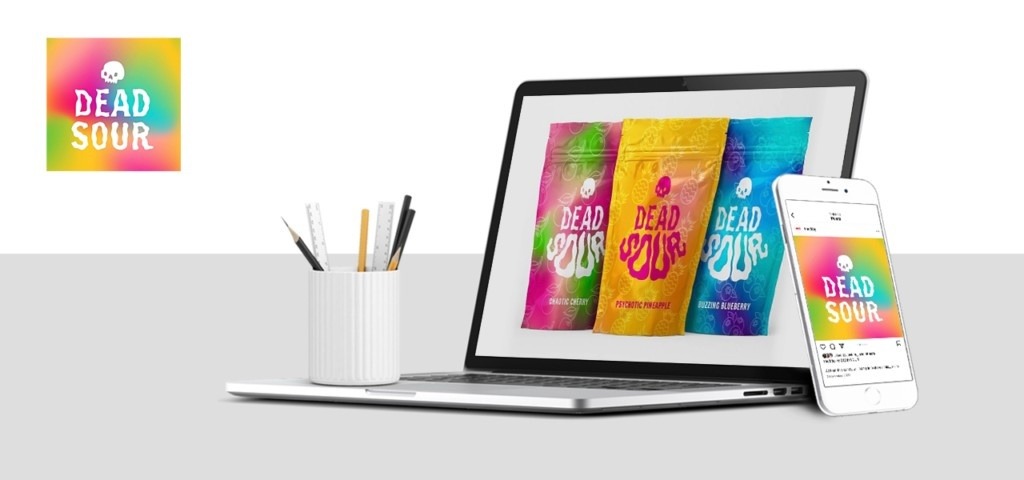
- Packaging with Bite: Think aluminum foil meets a mesmerizing gradient. We designed packaging that pops on shelves, featuring the sour mascot and vibrant fruit characters representing each flavour.
A Store that Screams Sour: The DEAD SOUR experience doesn’t stop at the candy itself. We designed a mini studio store that’s a pocket-sized explosion of funky vibrancy. Picture a mellow yellow entrance that opens into a pink and blue paradise featuring everyone’s favourite sour queen.